
Note to those unfamiliar with Champions: "Agents" are normals who are part of an organization that is usually involved with Supers in some capacity.
First up: Terror Inc., a South American organization run by the super-villain Professor Muerte from Enemies II

Mechanics: I'm not going to get into game stats here but what you see there is pretty standard for an agent - some armor, some HTH training, and a gun, all with characteristics within the normal human range.
Style: Compared to SAT this is downright understated. Make the skull insignia, boots, gloves, and belt white or silver with the rest of it black and you have a kind of Punisher junior look. That's simple and classy enough that it might still work today. I have to say this is one of the better looking uniforms out there. The mustache is a little too Magnum PI but that's easily fixed.
Next up is Project Genocide, the early Champions Universe's anti-mutant organization from Enemies:

Mechanics - similar and similarly not the focus of this post
Style: Now we're getting somewhere. First up, the helmet! With goggles! Then we get into multicolored tights (judging by that pattern), a belt, and a jagged "G" on the chest - much better! The description doesn't make any mention of color so we could go in any direction - maybe black and yellow? I think these look fairly dated now but a lot of it is the helmet - redesign that and give the tights a heavier, body armor type look and it might still work.
Third, we have the classic Viper agent:
This is a heavy weapons agent but it's a little hard to see the actual uniform with the side view. Let's look at the Viper Nest Leader:

Oh yeah, now we can see it! Those dark areas are green while the light areas are yellow. It has all the classic super-uniform touches: helmet, visor/goggles, pointy over-vest thing, utility belt, insignia... sigh... it's like coming home again. That V on the helmet is red by the way. I'm not sure about the snake. I'm pretty sure the basic Viper color scheme has remained the same through 5th edition and probably into 6th. Fifth went with a more militaristic uniform and a faceless mirrored helmet design, but it was still green. This one still looks like a 60's or 70's depiction to me though.
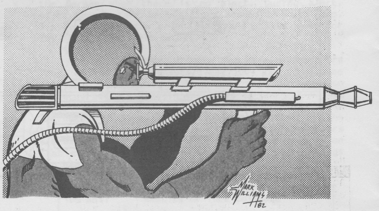
Finally, the grand finale (for today): UNTIL, circa 1982:

Yeah! Bubble Helmet FTW! OK looking more closely it's not actually a bubble helmet but the way it is drawn it looks almost like one. Vest! Combat harness! Thigh holsters & sheaths! I'm not sure about color but I would guess blue for the dark and white for the... white. He looks like a 50's or 60's "Space Patrolman" more than a comic book agent but I still like it in a weirdly retro way. It's my favorite among these as far as conveying "this is a comic book".
That's about all of the agents I could find in my early Champions stuff. However, inspired by Dr. Rotwang! tomorrow's theme is "color" and it should be fun.
No comments:
Post a Comment