Thursday, June 16, 2011

Champions in Color Special: Ripper

Stepping back to the early days of Champions we have the cover of Stronghold:


That's one of my favorite covers from the whole line. The subject of the piece is "Ripper", a Vietnam veteran who was subjected to some horrible experiments and who can boost his strength to *100* when he needs to do so. He's an awesome villain and that cover really makes him look good. Those poor guards and security bots clearly stand no chance against him!

However there is the ... color ... issue: he is colored a sort of ... pink. It's hard to admit, but there it is. We can talk about this openly, can't we? It's a little odd to have a badace ex-military villain who is potentially stronger than Grond and then color him pink. I'm going to go with the "interpretation" and the "printing error" theories here and say he was supposed to be either flesh-colored or purple instead of pink. Either one makes more sense, or at least looks better. Even if one insists he must be pink, he's still one of my favorites. Then look at what they did to him in 4th edition's "Classic Enemies" (I know it's not color, bear with me) 


So I guess he stopped working out and started eating a bunch of pork rinds in prison? Decided it was safer in there and gave up trying to escape? Gained a few levels of horizontal growth har har? I don't know but compared to the lean and mean guy on the cover of Stronghold, this is a disappointment. However, he did get the cover picture of that book which made up for a lot:


Now that's an image that lives up to the original!

(Side commentary: Oh look, it's Seeker being beaten like a rented mule. Clearly this is a 4th Edition book!)

Some time after this, though, he seems to have joined up with Viper, to the point they put him on another cover:


Well, he at least looks meaner here. Still kinda pink though. Hmmm, I wonder if he's around for 6th edition? Don't know, I'm opting out of that one. But Champions Online is a fun game and it's pretty closely tied to 6E. How about that?


Ugh! Too much cyber and not enough altered human! I'm still not sure about his color there either. Bleah, I'll take early 80's Ripper over that generic-looking cyberzombie any day!


Yeah, that's better.

Wednesday, June 15, 2011

Colors and Covers

I thought we might walk down memory lane a bit with some brighter entries in the early days of Champions art.

First up is the cover of the 82 Champions boxed set:


(My box is temporarily unavailable so I had to borrow Barking Alien's - Promise I'll give it back! I'll try to keep the kids out of the garage too so they stop knocking over my carefully balanced stacks of stuff)

I eventually learned that the guy with the eyebeam was named "Holocaust". I still think he looks pretty cool. Is he in the book? No! I think it's a valid assumption to think that characters pictured on the cover of a book might appear inside said book but apparently that's not the case here. Costume-wise those are some bold choices. Red and purple and yellow are not colors you see combined a whole lot. Maybe he's going for a Magneto look. Regardless, I like it. At the time I didn't know if he was a her, or a villain or what. Maybe he's one of those back and forth types, making the Magneto connection all the stronger.

I don't know the other guy's name. I thought it might be "Icestar" who is mentioned in the credits but I'm not sure. The glowing red fist sort of shoots down that theory. He's not quite as distinctive as the other guy anyway.

Within a year of picking up Champions, I picked up Enemies:


Ah, Flare (love that costume) Wait - well, lookee here. It's that guy again, the badace with the eye blasts. Looks like he's kicked a whole team's ace and he's taking their girl! Awesome! He's clearly not a guy you jack around with! Is he an uber-villain? Is he a hero who beat them all down while they were mind-controlled and then rescued his girlfriend? I don't know! Let's look inside and finally discover the truth about this mighty force! Flip flip flip - he's not in here! We have a badguy book with a possible badguy on the cover and HE'S NOT IN IT! FALSE! TREACHERY!

Anyway (breathe) he's not in the book. It's an awesome cover and none of the characters pictured on it are in this book. I used to hate stuff like this. Thank goodness I got over it.

Next I picked up Enemies II (actually I got them at the same time)


I'll save you the mystery - he's not in here either. But some of the people on the cover are! Let's see there's The Monster (always a favorite of mine), Oculon (wow those colors are not ... good), Foxbat (the comic relief of the Champions universe), Radium (that red look is kind of cool, not the first thing that comes to mind when I hear "Radium"), and finally Grond.

 Then they are opposed by The Champions (old school style) Goliath (don't like brown but I like it otherwise), Marksman (more on him later), Icestar (that's a good look), and Gargoyle looking pretty cool up close.

These same heroes also turn up on the cover of Champions II:


 Look, it's a Danger Room! Still a sort of new or unusual idea back then and a good choice for a cover IMO. It's the whole team minus Gargoyle (that's him walking in the door in human form). Not sure what those yellow things are on the back cover but they appear to be some sort of projectile - presumably that's why Rose is teleporting away from them

 Let's talk about Marksman. The permed/afro look was never a good one on a white guy. Plus I always saw it as more of a 70's thing that was dying out by this time. I mean, nobody does that look anymore.


 OK, except for Mister Fission. He's an homage to both Marksman (I always kind of liked the costume itself) and science teachers. Specifically Mr. Stanton, my 8th grade science teacher who had very similar hair.
 
That's enough for today. Tomorrow we will continue with a focus on one of my favorite villains from this time.

Tuesday, June 14, 2011

Unfortunate Characters Special Edition: Agents!

Given the fun we all had with the SAT agent on Friday I decided to take a look at some of the other agents from the early days of the game.

Note to those unfamiliar with Champions: "Agents" are normals who are part of an organization that is usually involved with Supers in some capacity.

First up: Terror Inc., a South American organization run by the super-villain Professor Muerte from Enemies II


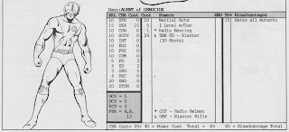
Mechanics: I'm not going to get into game stats here but what you see there is pretty standard for an agent - some armor, some HTH training, and a gun, all with characteristics within the normal human range.

Style: Compared to SAT this is downright understated. Make the skull insignia, boots, gloves, and belt white or silver with the rest of it black and you have a kind of Punisher junior look. That's simple and classy enough that it might still work today. I have to say this is one of the better looking uniforms out there. The mustache is a little too Magnum PI but that's easily fixed.

Next up is Project Genocide, the early Champions Universe's anti-mutant organization from Enemies:


Mechanics - similar and similarly not the focus of this post

Style: Now we're getting somewhere. First up, the helmet! With goggles! Then we get into multicolored tights (judging by that pattern), a belt, and a jagged "G" on the chest - much better! The description doesn't make any mention of color so we could go in any direction - maybe black and yellow? I think these look fairly dated now but a lot of it is the helmet - redesign that and give the tights a heavier, body armor type look and it might still work.

Third, we have the classic Viper agent:


This is a heavy weapons agent but it's a little hard to see the actual uniform with the side view. Let's look at the Viper Nest Leader:


Oh yeah, now we can see it! Those dark areas are green while the light areas are yellow. It has all the classic super-uniform touches: helmet, visor/goggles, pointy over-vest thing, utility belt, insignia... sigh... it's like coming home again. That V on the helmet is red by the way. I'm not sure about the snake. I'm pretty sure the basic Viper color scheme has remained the same through 5th edition and probably into 6th. Fifth went with a more militaristic uniform and a faceless mirrored helmet design, but it was still green. This one still looks like a 60's or 70's depiction to me though.

Finally, the grand finale (for today): UNTIL, circa 1982:


Yeah! Bubble Helmet FTW! OK looking more closely it's not actually a bubble helmet but the way it is drawn it looks almost like one. Vest! Combat harness! Thigh holsters & sheaths! I'm not sure about color but I would guess blue for the dark and white for the... white. He looks like a 50's or 60's "Space Patrolman" more than a comic book agent but I still like it in a weirdly retro way. It's my favorite among these as far as conveying "this is a comic book".

That's about all of the agents I could find in my early Champions stuff. However, inspired by Dr. Rotwang! tomorrow's theme is "color" and it should be fun.

Sunday, June 12, 2011

SAT Follow Up

If you didn't see the comments on the SAT Agent then take a look at this.


I think I have a new theme for this week...